Geist Beer
Geist cares a lot about their beer. From their yeast lab, through their cold-chain, and even sustainable disposal of their waste, there was a lot to talk about, and it is only going to grow. As we planned out the architecture of the site, we therefore placed a lot of value on discovery. Visitors to a brewery don’t arrive looking to learn about waste disposal, but instead chance upon the information and remember it in context.
The Content
We worked with the content writer Geetanji Chitnis to structure the site into broad sections covering the brand, the brewing and the beer. And then embedded each with components leading to interesting finds across the site. The design came from the need to be able to display any kind of content in any context across the site—we worked “content-out”.
The Design
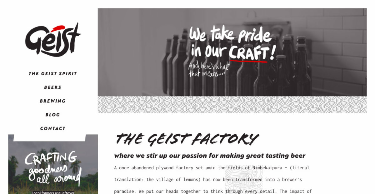
The branding and illustration from Vinayak Varma came with a raw black, white and red palette and a hand-drawn texture. It was tying together the natural, unprocessed care Geist put into their beer. The web design then, had to embrace the most natural part of the web—reflow. The web is naturally responsive, and although that is now a buzzword, the oldest page on the internet is also entirely responsive. To recreate that ability, and stay true to allowing the content to dictate form, each piece on a page contracts itself and then finds room on the page to be placed. This results in a site that doesn’t look the same across screen sizes, but uses all the space there is, and encourages discovery.
Accessibility
Because a lot of the text on the site is handwritten, we had to customise the CMS to take a text field alongside every image. Then on the front-end, we display the image, but also have the text visible to only screen readers. The result is a site made of images of text, that screen-readers can comfortably read through.
- Release
- July 2017
- Involvement
- Content planning, graphic design, typography & photography, HTML+CSS, Wordpress
