12th March 2010
Hitting double digits feels like an achievement, and this is the 10th version of this site. Truthfully, I’m not sure whether that’s a good thing, but the reason it’s gone through so much change is because I use this site as a lab for experimentation. Redoing this site over and over has taught me a lot about design, typo and programming, among more intangible things like time management, efficiency and shit (I’d recommend having a little project you can do random stuff to…). So, as one of the first posts on the first HTML version of the site, which is now powered by the wonderful WordPress, I figured I’d run through the past versions (at least the ones I still have) for, if nothing else, posterity – maybe it’ll even make me feel all warm and fuzzy inside.
Here goes nothing:
I seem to have misplaced versions 1-3 although I’m quite fond of their memory.
Ver 4

The philosophy was strong, I was young, and thought I had simple answers to everything. In fact, I think I still do.
Ver 5

Flickr RSS feeds start running the content of the site.
Ver 6

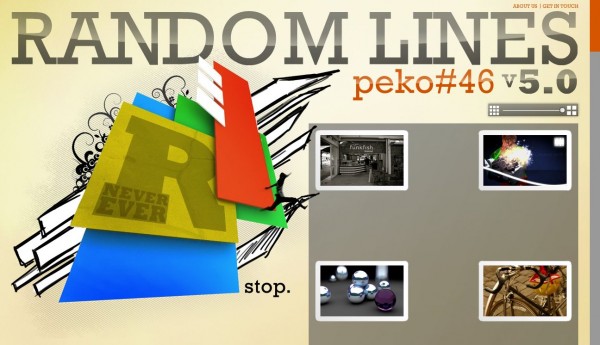
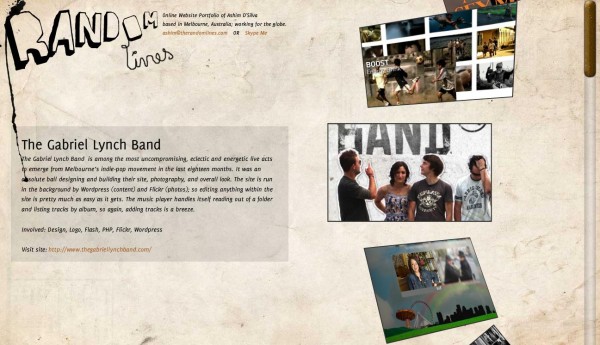
I move to Melbourne, get grunge influence again and the site turns into a portfolio. Also one of my first experiments with real time 3D in Flash.
Ver 7

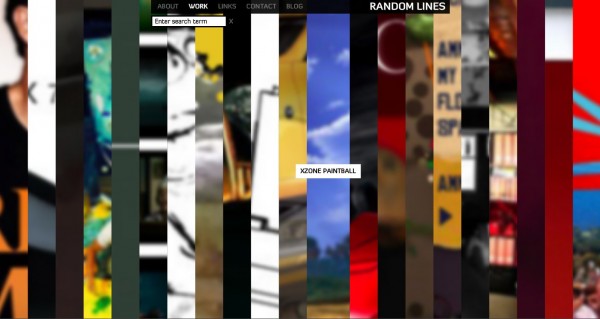
I learn a lot about programming in a short time in Melbourne – the new site runs well, has a live search, and is reaching for simplicity.
This actually still runs so here’s a running version if you like.
Ver 8

This version came more out of boredom and a random idea, but needed to be replaced fast because it wasn’t too efficient.
And a running version.
Ver 9

I studied game design in Melbourne, and in the process picked up some physics and maths – this came as an experiment with bounding boxes and object collision (really basic physics). Extremely fun to make, and to play with afterwards.
And yes: running version.
Ver 10
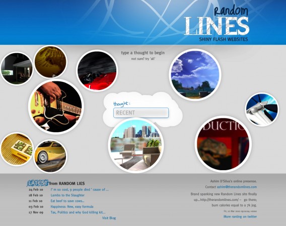
So after all that playing with Flash and ignoring HTML because of all it’s oddities, ver 10 is the breakout. It’s powered by , taught me heaps more PHP and broke the HTML/CSS boundary for me.
The learning
I learnt a lot visually and technically over the versions, but most importantly, I found a hobby directly helping my most lucrative skill set. I think every commercial artist (designer, programmer, writer, photographer…) who is usually bound by someone else’s thoughts and wallet, should definitely find something they are in control of, and run with it. A side project, that you can play with, toss around, fail with and get back up.
Glad I did this, now to kill some zombies…

